
Building a digital identity platform for athletes.
STAXS was an end-to-end product and brand design project focused on creating a digital platform where athletes can build their sporting identity, showcase their achievements and connect with coaches, recruiters and the wider sporting community. During the project, we worked across product strategy, user experience, interface design and brand identity, taking the platform from early concept through to a cohesive mobile experience and supporting marketing assets.
Building a digital identity platform for athletes.
STAXS was an end-to-end product and brand design project focused on creating a digital platform where athletes can build their sporting identity, showcase their achievements and connect with coaches, recruiters and the wider sporting community. During the project, we worked across product strategy, user experience, interface design and brand identity, taking the platform from early concept through to a cohesive mobile experience and supporting marketing assets.
Building a digital identity platform for athletes.
STAXS was an end-to-end product and brand design project focused on creating a digital platform where athletes can build their sporting identity, showcase their achievements and connect with coaches, recruiters and the wider sporting community. During the project, we worked across product strategy, user experience, interface design and brand identity, taking the platform from early concept through to a cohesive mobile experience and supporting marketing assets.
Client
Scope of work
Branding, Product Design, Web Design
Branding, Product Design,
Web Design
Timeline
1 month
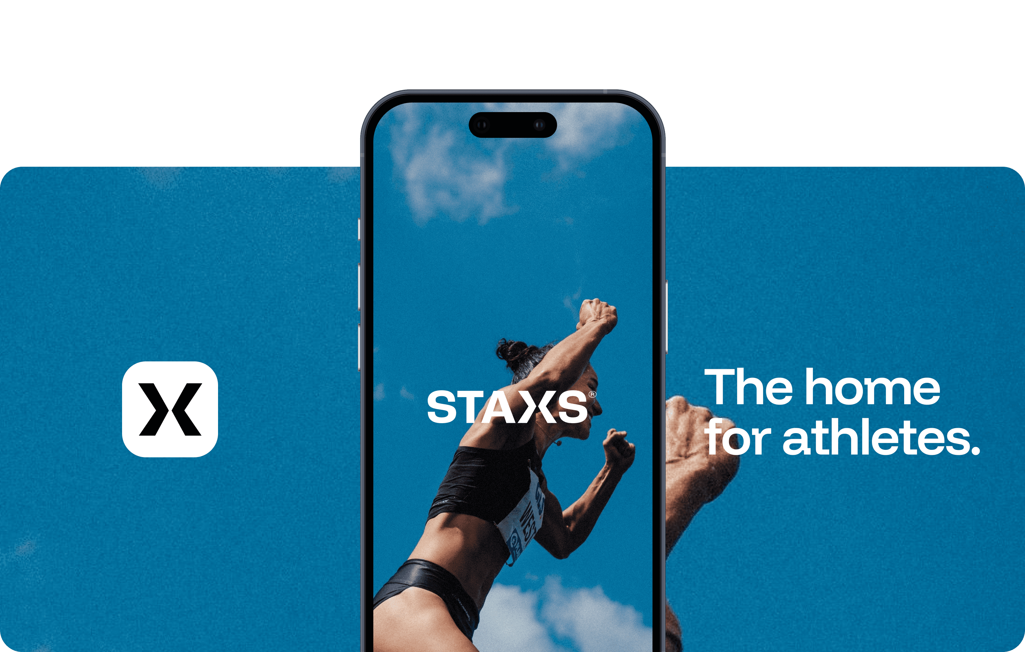
The challenge wasn't simply designing another sports app. It was creating a platform that could support multiple user groups, including athletes, coaches and recruiters, while maintaining a simple and intuitive experience.
Every interaction was designed to strengthen an athlete's digital identity, making it easier to showcase achievements, evaluate talent and celebrate meaningful career milestones.
The challenge wasn't simply designing another sports app. It was creating a platform that could support multiple user groups, including athletes, coaches and recruiters, while maintaining a simple and intuitive experience.
Every interaction was designed to strengthen an athlete's digital identity, making it easier to showcase achievements, evaluate talent and celebrate meaningful career milestones.
The challenge wasn't simply designing another sports app. It was creating a platform that could support multiple user groups, including athletes, coaches and recruiters, while maintaining a simple and intuitive experience.
Every interaction was designed to strengthen an athlete's digital identity, making it easier to showcase achievements, evaluate talent and celebrate meaningful career milestones.

The product experience combines bold typography, restrained colour and a minimal interface to keep the focus on what matters most: The athlete.
The product experience combines bold typography, restrained colour and a minimal interface to keep the focus on what matters most: The athlete.

From concept to launch.
From concept to launch.
From concept
to launch.
Brand Identity
Brand Identity
2 weeks
2 weeks
A visual identity that balances confidence and approachability, creating a distinctive brand that scales consistently.
A visual identity that balances confidence and approachability, creating a distinctive brand that scales consistently.
Marketing Website
Marketing Website
1 week
1 week
A website that introduces the platform, communicates its vision and establishes a strong first impression.
A website that introduces the platform, communicates its vision and establishes a strong first impression.
Branding
Branding
2 - 3 weeks
2 - 3 weeks
The brand direction needed to strike a balance: innovative without being cold, professional without feeling corporate
The brand direction needed to strike a balance: innovative without being cold, professional without feeling corporate

KEY INSIGHT
Athletes already have the data. The challenge was bringing it together in a way that feels meaningful.
STAXS was designed around the idea that an athlete's identity extends beyond performance statistics.
By combining verified data, career milestones and community interactions into a single experience, the platform creates a richer representation of an athlete's journey while making talent easier to discover and evaluate.
KEY INSIGHT
Athletes already have the data. The challenge was bringing it together in a way that feels meaningful.
STAXS was designed around the idea that an athlete's identity extends beyond performance statistics.
By combining verified data, career milestones and community interactions into a single experience, the platform creates a richer representation of an athlete's journey while making talent easier to discover and evaluate.
KEY INSIGHT
Athletes already have the data. The challenge was bringing it together in a way that feels meaningful.
STAXS was designed around the idea that an athlete's identity extends beyond performance statistics.
By combining verified data, career milestones and community interactions into a single experience, the platform creates a richer representation of an athlete's journey while making talent easier to discover and evaluate.
The STAXS identity was designed to represent movement, progression and connection. A bold wordmark paired with a distinctive geometric symbol creates a confident, recognisable brand that scales seamlessly across digital products, marketing and future brand applications.
The STAXS identity was designed to represent movement, progression and connection. A bold wordmark paired with a distinctive geometric symbol creates a confident, recognisable brand that scales seamlessly across digital products, marketing and future brand applications.


Clear navigation, familiar interaction patterns and progressive disclosure help athletes move from sign up to a complete profile with minimal effort.
Clear navigation, familiar interaction patterns and progressive disclosure help athletes move from sign up to a complete profile with minimal effort.
Clear navigation, familiar interaction patterns and progressive disclosure help athletes move from sign up to a complete profile with minimal effort.


The home experience brings together performance insights, leaderboards, wellness metrics and profile activity into a single, intuitive dashboard.
The home experience brings together performance insights, leaderboards, wellness metrics and profile activity into a single, intuitive dashboard.
The home experience brings together performance insights, leaderboards, wellness metrics and profile activity into a single, intuitive dashboard.
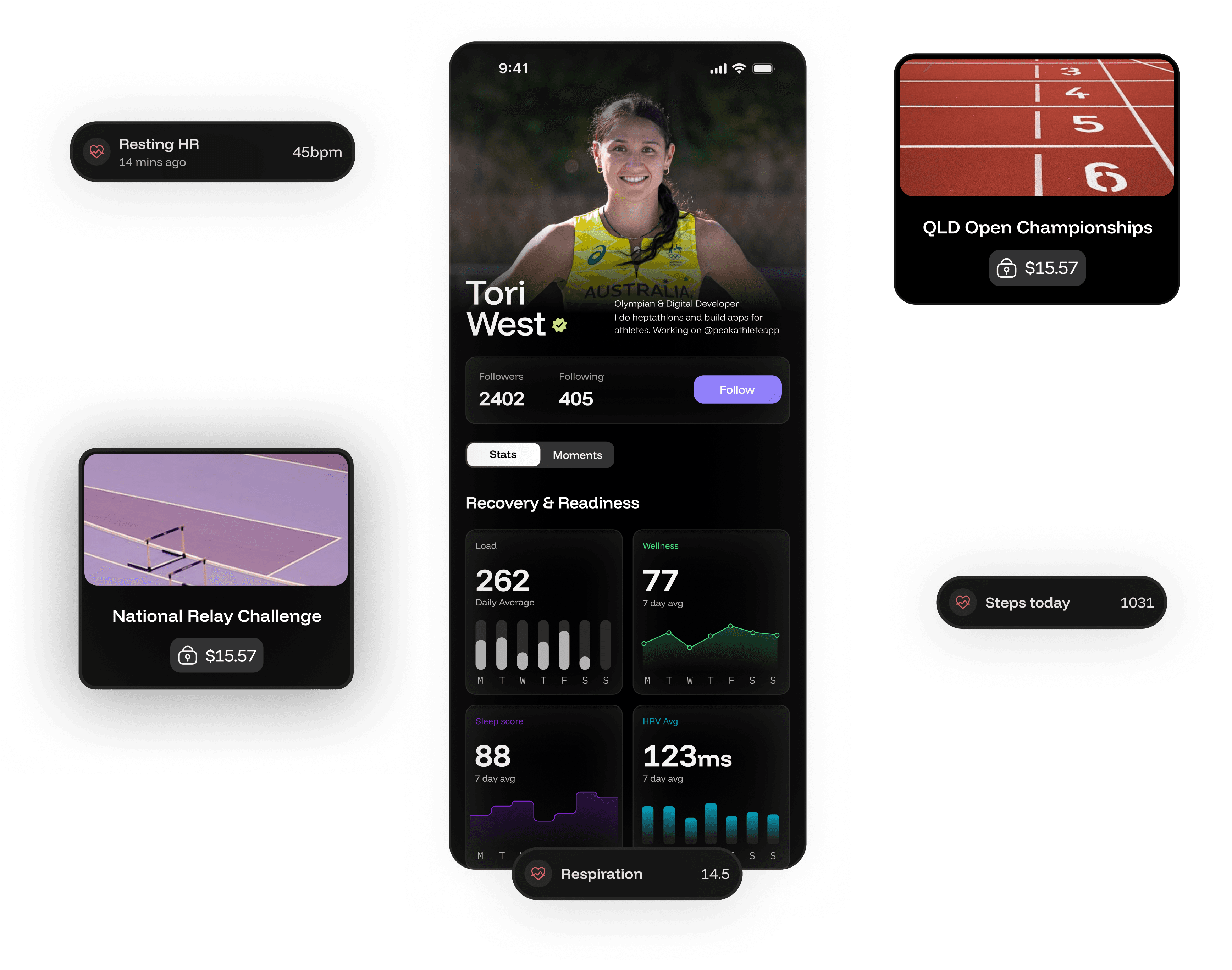

This version is bold and direct, with inward arrows forming the “X” to express convergence and data flow. The gesture subtly nods to the sister brand’s “Peak” mark while standing distinct. Strong typography ensures clarity, scalability, & impact at any size.
This version is bold and direct, with inward arrows forming the “X” to express convergence and data flow. The gesture subtly nods to the sister brand’s “Peak” mark while standing distinct. Strong typography ensures clarity, scalability, & impact at any size.
This version is bold and direct, with inward arrows forming the “X” to express convergence and data flow. The gesture subtly nods to the sister brand’s “Peak” mark while standing distinct. Strong typography ensures clarity, scalability, & impact at any size.
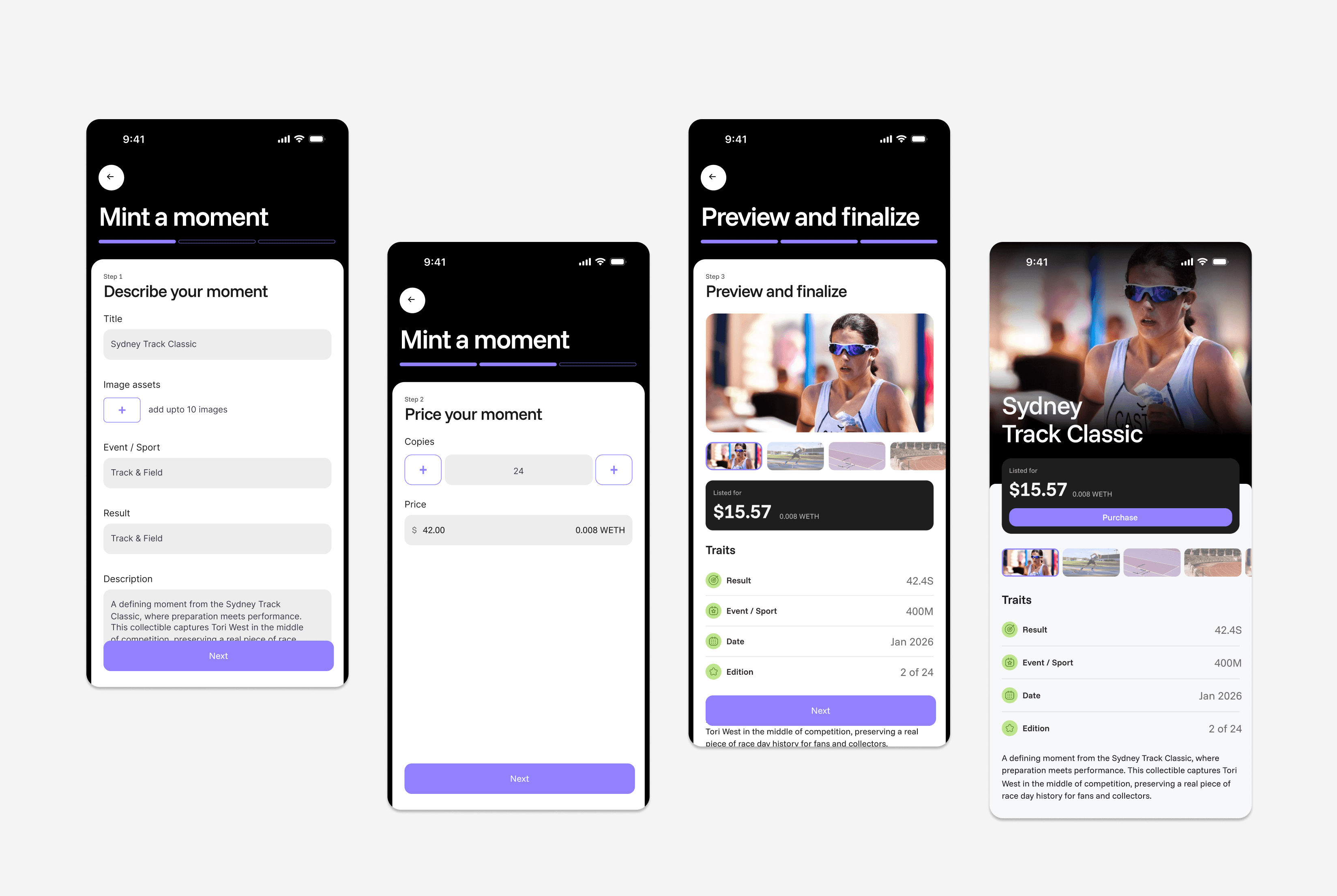
With athletes spanning different sports, demographics and performance levels, discovery needed to go beyond a simple search. Layered filtering lets users progressively narrow results by the criteria that matter to them, while keeping the default experience lightweight and easy to scan.
With athletes spanning different sports, demographics and performance levels, discovery needed to go beyond a simple search. Layered filtering lets users progressively narrow results by the criteria that matter to them, while keeping the default experience lightweight and easy to scan.
With athletes spanning different sports, demographics and performance levels, discovery needed to go beyond a simple search. Layered filtering lets users progressively narrow results by the criteria that matter to them, while keeping the default experience lightweight and easy to scan.


The marketing website translated STAXS’ product and visual identity into a clear narrative, using visual storytelling to introduce key features while maintaining consistency with the in-app experience.
The marketing website translated STAXS’ product and visual identity into a clear narrative, using visual storytelling to introduce key features while maintaining consistency with the in-app experience.
The marketing website translated STAXS’ product and visual identity into a clear narrative, using visual storytelling to introduce key features while maintaining consistency with the in-app experience.


The identity went through extensive exploration before reaching the final direction. We tested different interpretations of data, exchange, ownership and movement, refining each concept to find a mark that felt distinctive, athletic and scalable across the STAXS ecosystem.
The identity went through extensive exploration before reaching the final direction. We tested different interpretations of data, exchange, ownership and movement, refining each concept to find a mark that felt distinctive, athletic and scalable across the STAXS ecosystem.
The identity went through extensive exploration before reaching the final direction. We tested different interpretations of data, exchange, ownership and movement, refining each concept to find a mark that felt distinctive, athletic and scalable across the STAXS ecosystem.
The identity went through extensive exploration before reaching the final direction. We tested different interpretations of data, exchange, ownership and movement, refining each concept to find a mark that felt distinctive, athletic and scalable across the STAXS ecosystem.
The identity went through extensive exploration before reaching the final direction. We tested different interpretations of data, exchange, ownership and movement, refining each concept to find a mark that felt distinctive, athletic and scalable across the STAXS ecosystem.
The identity went through extensive exploration before reaching the final direction. We tested different interpretations of data, exchange, ownership and movement, refining each concept to find a mark that felt distinctive, athletic and scalable across the STAXS ecosystem.


