
Project overview
Thiramy is an enterprise skills framework platform that helps organisations map, assess and develop employee capabilities. The initial brief was to refresh the UI, but after auditing the product we established that the experience needed more than a visual update. We reworked the information architecture, simplified key user journeys and redesigned the platform from the ground up, delivering over 40 screens, complete screen states, a new landing page and supporting marketing assets within a one-month timeline.
Project overview
Thiramy is an enterprise skills framework platform that helps organisations map, assess and develop employee capabilities. The initial brief was to refresh the UI, but after auditing the product we established that the experience needed more than a visual update. We reworked the information architecture, simplified key user journeys and redesigned the platform from the ground up, delivering over 40 screens, complete screen states, a new landing page and supporting marketing assets within a one-month timeline.
Project overview
Thiramy is an enterprise skills framework platform that helps organisations map, assess and develop employee capabilities. The initial brief was to refresh the UI, but after auditing the product we established that the experience needed more than a visual update. We reworked the information architecture, simplified key user journeys and redesigned the platform from the ground up, delivering over 40 screens, complete screen states, a new landing page and supporting marketing assets within a one-month timeline.
Client
Scope of work
Product Design, Web Design
Branding, Product Design,
Web Design
Timeline
1 month

The challenge
Thiramy’s 0 → 1 Platform
The original brief was a visual refresh, but after auditing the product it became clear the biggest issues weren't visual, they were structural. Instead of simply reskinning the interface, we reworked the core user journeys, simplified complex workflows and rebuilt the experience from the ground up, all within a one-month timeline.
The challenge
Thiramy’s 0 → 1 Platform
The original brief was a visual refresh, but after auditing the product it became clear the biggest issues weren't visual, they were structural. Instead of simply reskinning the interface, we reworked the core user journeys, simplified complex workflows and rebuilt the experience from the ground up, all within a one-month timeline.
The challenge
Thiramy’s 0 → 1 Platform
The original brief was a visual refresh, but after auditing the product it became clear the biggest issues weren't visual, they were structural. Instead of simply reskinning the interface, we reworked the core user journeys, simplified complex workflows and rebuilt the experience from the ground up, all within a one-month timeline.
Problem #1
Core workflows required too many steps, making common tasks slower & complicated.
Problem #1
Core workflows required too many steps, making common tasks slower & complicated.
Problem #2
Different users were forced through similar experiences despite having different needs.
Problem #2
Different users were forced through similar experiences despite having different needs.
Problem #2
Different users were forced through similar experiences despite having different needs.
Problem #3
The experience needed structural improvements, not just a visual refresh.
Problem #3
The experience needed structural improvements, not just a visual refresh.
Research
Looking deep into current enterprise landscape
Before designing anything, we audited the existing product to understand how users actually moved through the platform. This helped identify recurring usability issues, unnecessary complexity and opportunities to simplify key workflows before any visual work began.
Research
Looking deep into current enterprise landscape
Before designing anything, we audited the existing product to understand how users actually moved through the platform. This helped identify recurring usability issues, unnecessary complexity and opportunities to simplify key workflows before any visual work began.
Research
Looking deep into current enterprise landscape
Before designing anything, we audited the existing product to understand how users actually moved through the platform. This helped identify recurring usability issues, unnecessary complexity and opportunities to simplify key workflows before any visual work began.
Who are we designing for?
Designing for three distinct user groups
Each user interacts with the platform differently. Rather than creating a one-size-fits-all experience, the product was structured around the responsibilities, permissions and goals of Super Admins, Admins and Users, ensuring each role only sees what they need.
Who are we designing for?
Designing for three distinct user groups
Each user interacts with the platform differently. Rather than creating a one-size-fits-all experience, the product was structured around the responsibilities, permissions and goals of Super Admins, Admins and Users, ensuring each role only sees what they need.
Who are we designing for?
Designing for three distinct user groups
Each user interacts with the platform differently. Rather than creating a one-size-fits-all experience, the product was structured around the responsibilities, permissions and goals of Super Admins, Admins and Users, ensuring each role only sees what they need.
Super admins
Designed for Thiramy's internal team, responsible for managing organisations, platform settings and global skills frameworks across every customer
Admin
Responsible for managing their organisation's people, skills and performance
User
Completes assessments, views progress and develops skills through a focused, distraction-free experienc

The solution
Design Principles
The solution
Design Principles
The solution
Design Principles
Consistency
Reusable patterns reduce learning time and create a more predictable experience.
Accessibility
Clear hierarchy, readable layouts and inclusive interactions improve usability across every screen.
Progressive Disclosure
Complex information is introduced gradually, helping users stay focused on one decision at a time.


First Journey
Super admins
The Super Admin experience acted as the foundation of the platform, giving organisations complete control over their teams, frameworks and platform configuration. Information was prioritised to surface high-level insights first, while keeping management tasks easily accessible without overwhelming the interface.
First Journey
Super admins
The Super Admin experience acted as the foundation of the platform, giving organisations complete control over their teams, frameworks and platform configuration. Information was prioritised to surface high-level insights first, while keeping management tasks easily accessible without overwhelming the interface.
First Journey
Super admins
The Super Admin experience acted as the foundation of the platform, giving organisations complete control over their teams, frameworks and platform configuration. Information was prioritised to surface high-level insights first, while keeping management tasks easily accessible without overwhelming the interface.
Feature
Making the Skills Directory easier to build, browse and maintain.
The Skills Directory became the source of truth for the entire platform. The experience was redesigned to make creating, organising and managing skills intuitive, allowing complex frameworks to be built without the friction typically associated with enterprise software.


Designing skill setup around how people naturally think.
Creating a skill framework involved multiple levels of hierarchy, from domains through to individual competencies. Rather than exposing every field at once, the experience progressively built each layer, helping users understand relationships while reducing cognitive load.


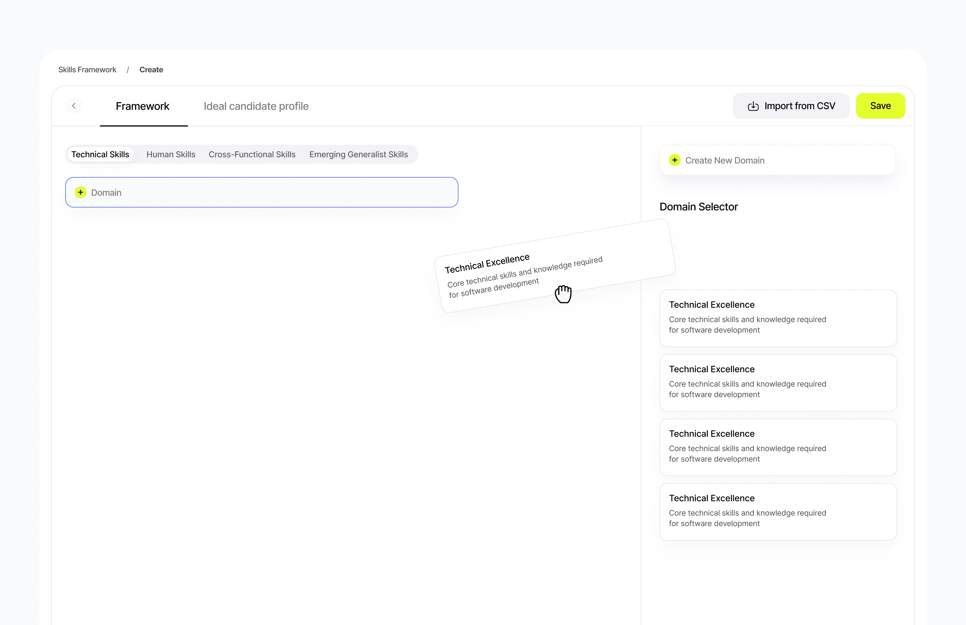
Structuring framework creation from the ground up.
Building a framework required balancing flexibility with simplicity. Drag-and-drop interactions, progressive setup and reusable components made it easy to assemble large frameworks while keeping users oriented throughout the process.


Simplifying the Admin experience
Admins focus less on building frameworks and more on managing people and performance. Their experience was streamlined around monitoring teams, reviewing assessments and taking action quickly, without exposing unnecessary platform controls.


Making assessment results easier to understand
Performance data was only valuable if users could understand it quickly. Results were designed to surface trends, identify strengths and highlight development opportunities through clear visual hierarchy rather than overwhelming tables of data.


Reducing friction throughout the assessment flow
The assessment experience was simplified into a focused, distraction-free workflow. Breaking questions into manageable sections helped users stay engaged while improving completion rates and reducing assessment fatigue.


Feature
Making the Skills Directory easier to build, browse and maintain.
The Skills Directory became the source of truth for the entire platform. The experience was redesigned to make creating, organising and managing skills intuitive, allowing complex frameworks to be built without the friction typically associated with enterprise software.
Feature
Making the Skills Directory easier to build, browse and maintain.
The Skills Directory became the source of truth for the entire platform. The experience was redesigned to make creating, organising and managing skills intuitive, allowing complex frameworks to be built without the friction typically associated with enterprise software.
Designing skill setup around how people naturally think.
Creating a skill framework involved multiple levels of hierarchy, from domains through to individual competencies. Rather than exposing every field at once, the experience progressively built each layer, helping users understand relationships while reducing cognitive load.
Designing skill setup around how people naturally think.
Creating a skill framework involved multiple levels of hierarchy, from domains through to individual competencies. Rather than exposing every field at once, the experience progressively built each layer, helping users understand relationships while reducing cognitive load.
Structuring framework creation from the ground up.
Building a framework required balancing flexibility with simplicity. Drag-and-drop interactions, progressive setup and reusable components made it easy to assemble large frameworks while keeping users oriented throughout the process.
Structuring framework creation from the ground up.
Building a framework required balancing flexibility with simplicity. Drag-and-drop interactions, progressive setup and reusable components made it easy to assemble large frameworks while keeping users oriented throughout the process.
Simplifying the Admin experience
Admins focus less on building frameworks and more on managing people and performance. Their experience was streamlined around monitoring teams, reviewing assessments and taking action quickly, without exposing unnecessary platform controls.
Simplifying the Admin experience
Admins focus less on building frameworks and more on managing people and performance. Their experience was streamlined around monitoring teams, reviewing assessments and taking action quickly, without exposing unnecessary platform controls.
Making assessment results easier to understand
Performance data was only valuable if users could understand it quickly. Results were designed to surface trends, identify strengths and highlight development opportunities through clear visual hierarchy rather than overwhelming tables of data.
Making assessment results easier to understand
Performance data was only valuable if users could understand it quickly. Results were designed to surface trends, identify strengths and highlight development opportunities through clear visual hierarchy rather than overwhelming tables of data.
Reducing friction throughout the assessment flow
The assessment experience was simplified into a focused, distraction-free workflow. Breaking questions into manageable sections helped users stay engaged while improving completion rates and reducing assessment fatigue.
Reducing friction throughout the assessment flow
The assessment experience was simplified into a focused, distraction-free workflow. Breaking questions into manageable sections helped users stay engaged while improving completion rates and reducing assessment fatigue.
