
Designing and developing an entire Influencer marketplace
Follwr is a creator marketplace helping social media influencers monitize their content. The founder brought us on to design the entire experience from day one, covering everything from the branding and marketing website through to the product itself.
Designing and developing an entire Influencer marketplace
Follwr is a creator marketplace helping social media influencers monitize their content. The founder brought us on to design the entire experience from day one, covering everything from the branding and marketing website through to the product itself.
Designing and developing an entire Influencer marketplace
Follwr is a creator marketplace helping social media influencers monitize their content. The founder brought us on to design the entire experience from day one, covering everything from the branding and marketing website through to the product itself.
Client

Scope of work
Branding, Product Design, Web Design
Branding, Product Design,
Web Design
Timeline
8 months

The challenge
Helping creators build a business, not just a following.
Creating content is only one part of being a creator. The bigger challenge is finding opportunities, managing partnerships, communicating with brands and growing a sustainable business. Followr was designed to bring every part of that journey into one simple experience.
The challenge
Helping creators build a business, not just a following.
Creating content is only one part of being a creator. The bigger challenge is finding opportunities, managing partnerships, communicating with brands and growing a sustainable business. Followr was designed to bring every part of that journey into one simple experience.
The challenge
Helping creators build a business, not just a following.
Creating content is only one part of being a creator. The bigger challenge is finding opportunities, managing partnerships, communicating with brands and growing a sustainable business. Followr was designed to bring every part of that journey into one simple experience.
Problem #1
There was no existing product, design system or brand to build from. Every decision had to establish a strong foundation while leaving room for future growth.
Problem #2
Followr needed to work for both influencers and subscribers. The challenge was creating workflows that felt intuitive for each audience without making the platform overly complex.
Problem #2
Followr needed to work for both influencers and subscribers. The challenge was creating workflows that felt intuitive for each audience without making the platform overly complex.
Problem #3
From discovering campaigns to managing conversations and getting paid, the product had to handle multiple steps without feeling overwhelming. The focus was reducing friction and making every step feel straightforward.
The Branding
For creators, joining a new platform means investing their time, content and reputation.
The branding needed to communicate trust long before users interacted with the product. Every element, from the logo and colour palette to typography and iconography, was designed to feel polished, modern and creator-first, creating a visual system that could scale seamlessly across the website, app and marketing. The speech bubble represents conversations between creators and subscribers, while the '+' symbol reflects growth, opportunities and new connections. Paired with a soft glass-inspired style, the identity feels modern and fresh.
The Branding
For creators, joining a new platform means investing their time, content and reputation.
The branding needed to communicate trust long before users interacted with the product. Every element, from the logo and colour palette to typography and iconography, was designed to feel polished, modern and creator-first, creating a visual system that could scale seamlessly across the website, app and marketing. The speech bubble represents conversations between creators and subscribers, while the '+' symbol reflects growth, opportunities and new connections. Paired with a soft glass-inspired style, the identity feels modern and fresh.
The Branding
For creators, joining a new platform means investing their time, content and reputation.
The branding needed to communicate trust long before users interacted with the product. Every element, from the logo and colour palette to typography and iconography, was designed to feel polished, modern and creator-first, creating a visual system that could scale seamlessly across the website, app and marketing. The speech bubble represents conversations between creators and subscribers, while the '+' symbol reflects growth, opportunities and new connections. Paired with a soft glass-inspired style, the identity feels modern and fresh.


Marketing Website
Building confidence before sign-up
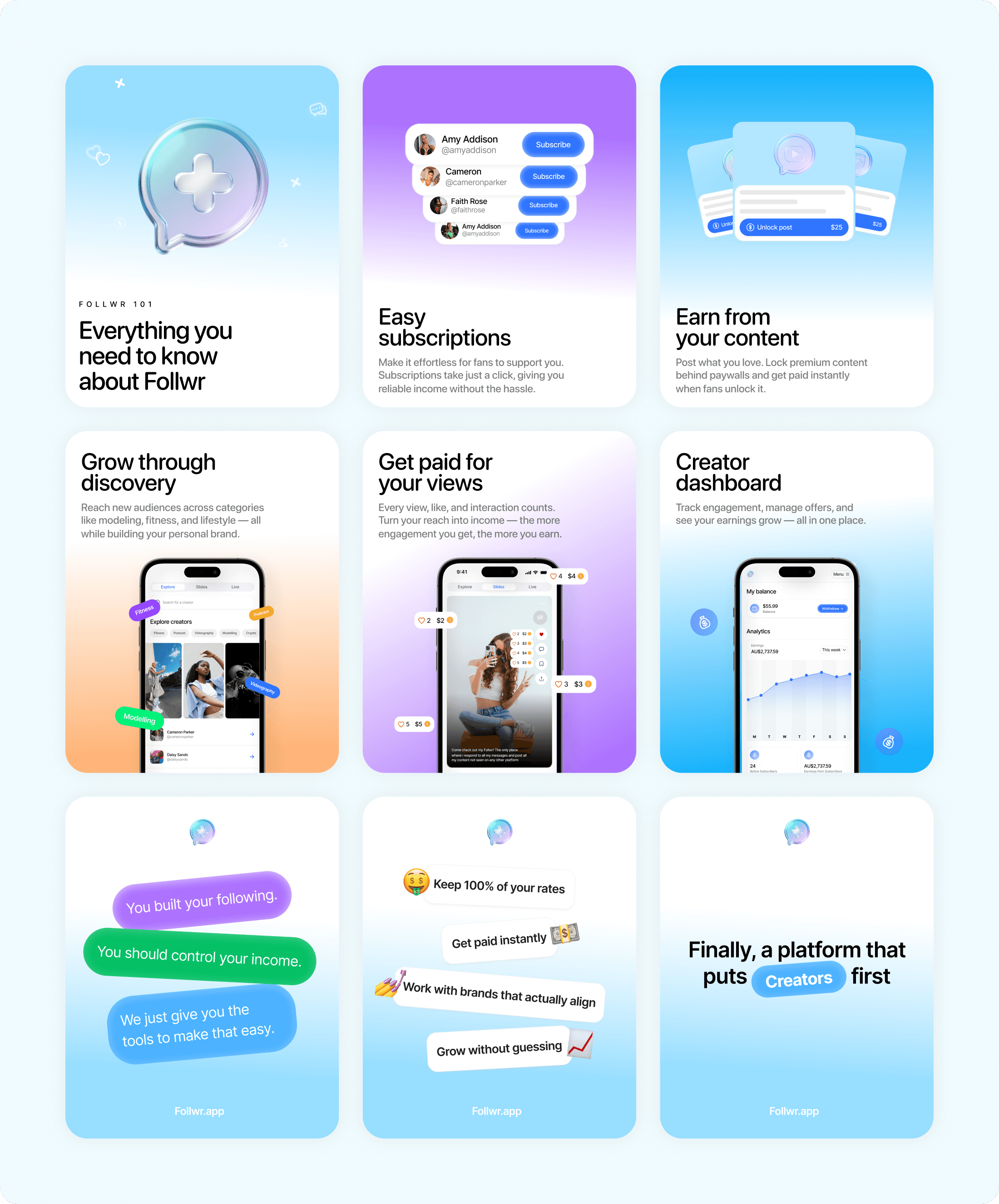
People don't join new platforms because they understand every feature, they join because they understand the value. Instead of leading with marketing copy, we structured the website to answer the questions users naturally have, gradually introducing the product through visuals, clear hierarchy and progressive storytelling.
Marketing Website
Building confidence before sign-up
People don't join new platforms because they understand every feature, they join because they understand the value. Instead of leading with marketing copy, we structured the website to answer the questions users naturally have, gradually introducing the product through visuals, clear hierarchy and progressive storytelling.
Marketing Website
Building confidence before sign-up
People don't join new platforms because they understand every feature, they join because they understand the value. Instead of leading with marketing copy, we structured the website to answer the questions users naturally have, gradually introducing the product through visuals, clear hierarchy and progressive storytelling.

The app
Removing friction from the creator journey
The biggest focus throughout the product was reducing friction. Influencers shouldn't have to think about where to tap next. Every workflow was designed to feel familiar, quick and effortless, helping creators spend less time managing content & more time creating it.
The app
Removing friction from the creator journey
The biggest focus throughout the product was reducing friction. Influencers shouldn't have to think about where to tap next. Every workflow was designed to feel familiar, quick and effortless, helping creators spend less time managing content & more time creating it.
The app
Removing friction from the creator journey
The biggest focus throughout the product was reducing friction. Influencers shouldn't have to think about where to tap next. Every workflow was designed to feel familiar, quick and effortless, helping creators spend less time managing content & more time creating it.
Reducing time to first success
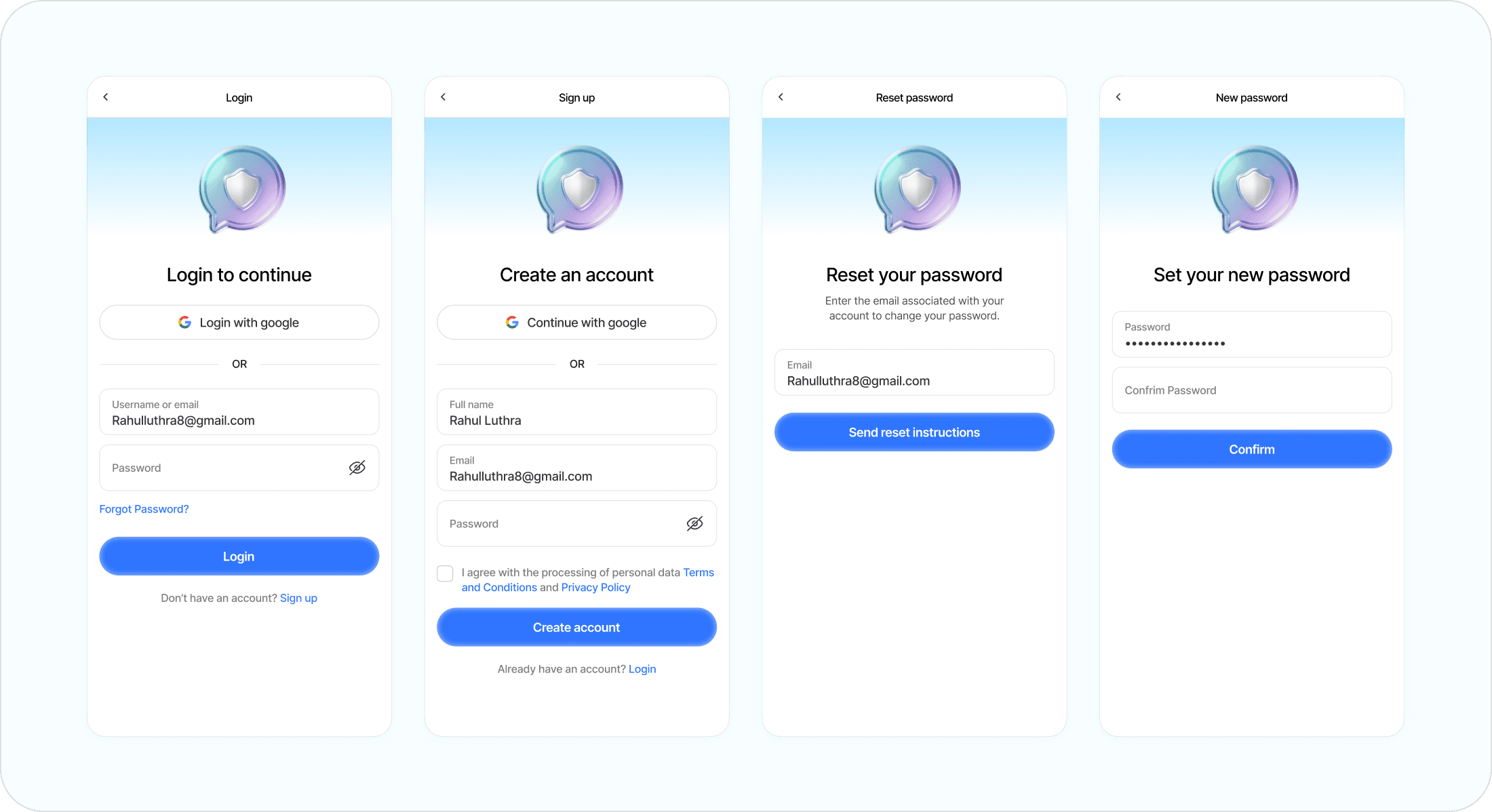
The first experience shapes how users perceive the entire product. Rather than asking creators to complete lengthy onboarding before seeing value, we focused on reducing the number of decisions upfront and guiding users towards their first meaningful action as quickly as possible.
Reducing time to first success
The first experience shapes how users perceive the entire product. Rather than asking creators to complete lengthy onboarding before seeing value, we focused on reducing the number of decisions upfront and guiding users towards their first meaningful action as quickly as possible.
Reducing time to first success
The first experience shapes how users perceive the entire product. Rather than asking creators to complete lengthy onboarding before seeing value, we focused on reducing the number of decisions upfront and guiding users towards their first meaningful action as quickly as possible.


Keeping different workflows feeling familiar
Every post has different requirements, but constantly changing the interface forces users to relearn the product. We standardised layouts, interactions and decision points across every post type, allowing creators to focus on their content rather than understanding a new workflow.
Keeping different workflows feeling familiar
Every post has different requirements, but constantly changing the interface forces users to relearn the product. We standardised layouts, interactions and decision points across every post type, allowing creators to focus on their content rather than understanding a new workflow.
Keeping different workflows feeling familiar
Every post has different requirements, but constantly changing the interface forces users to relearn the product. We standardised layouts, interactions and decision points across every post type, allowing creators to focus on their content rather than understanding a new workflow.


Encouraging discovery instead of search
Traditional marketplaces rely heavily on search and filters, assuming users already know what they're looking for. We designed ‘Explore’ to feel more like browsing than searching, making discovery a natural part of the experience while reducing the effort required to find relevant opportunities.
Encouraging discovery instead of search
Traditional marketplaces rely heavily on search and filters, assuming users already know what they're looking for. We designed ‘Explore’ to feel more like browsing than searching, making discovery a natural part of the experience while reducing the effort required to find relevant opportunities.
Encouraging discovery instead of search
Traditional marketplaces rely heavily on search and filters, assuming users already know what they're looking for. We designed ‘Explore’ to feel more like browsing than searching, making discovery a natural part of the experience while reducing the effort required to find relevant opportunities.

Designing around high-frequency interactions
Traditional marketplaces rely heavily on search and filters, assuming users already know what they're looking for. We designed ‘Explore’ to feel more like browsing than searching, making discovery a natural part of the experience while reducing the effort required to find relevant opportunities.
Designing around high-frequency interactions
Traditional marketplaces rely heavily on search and filters, assuming users already know what they're looking for. We designed ‘Explore’ to feel more like browsing than searching, making discovery a natural part of the experience while reducing the effort required to find relevant opportunities.
Designing around high-frequency interactions
Traditional marketplaces rely heavily on search and filters, assuming users already know what they're looking for. We designed ‘Explore’ to feel more like browsing than searching, making discovery a natural part of the experience while reducing the effort required to find relevant opportunities.


Scaling outreach with broadcast lists
As creators grow, so does the number of conversations they manage. Broadcast Lists were designed to reduce repetitive work while maintaining a communication experience that still feels personal and easy to manage.
Scaling outreach with broadcast lists
As creators grow, so does the number of conversations they manage. Broadcast Lists were designed to reduce repetitive work while maintaining a communication experience that still feels personal and easy to manage.
Scaling outreach with broadcast lists
As creators grow, so does the number of conversations they manage. Broadcast Lists were designed to reduce repetitive work while maintaining a communication experience that still feels personal and easy to manage.


Making growth feel like part of the product
Referral systems often feel disconnected from the core experience. Rather than treating it as a separate feature, we integrated it into existing user journeys so sharing felt like a natural extension of using the product instead of an interruption.
Making growth feel like part of the product
Referral systems often feel disconnected from the core experience. Rather than treating it as a separate feature, we integrated it into existing user journeys so sharing felt like a natural extension of using the product instead of an interruption.
Making growth feel like part of the product
Referral systems often feel disconnected from the core experience. Rather than treating it as a separate feature, we integrated it into existing user journeys so sharing felt like a natural extension of using the product instead of an interruption.

Extra screens
Beyond the core product, we designed dozens of supporting experiences including onboarding, settings, notifications, payments, account management, empty states, error states and everything in between, ensuring every interaction felt consistent across the platform.
Extra screens
Beyond the core product, we designed dozens of supporting experiences including onboarding, settings, notifications, payments, account management, empty states, error states and everything in between, ensuring every interaction felt consistent across the platform.
Extra screens
Beyond the core product, we designed dozens of supporting experiences including onboarding, settings, notifications, payments, account management, empty states, error states and everything in between, ensuring every interaction felt consistent across the platform.


